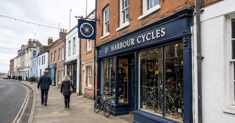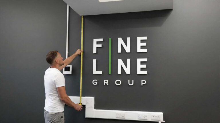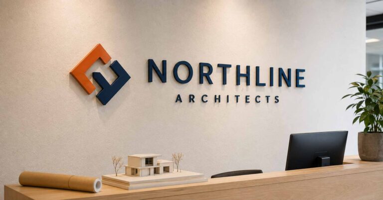


When most people think about signs they tend to focus on the colours, the size, or the overall design. But if I’m being honest, the font is probably the one thing that gets overlooked most often. Clarity and impact are what counts, and that means avoiding fonts that are too fussy and hard to read. The typeface you choose is going to have a direct impact on how easy your sign is to read – and how your business is viewed by the people who see it. So, when you’re choosing fonts for your signage, you need to think about not just how they look but also how well they’ll work in different situations and conditions. Whether that’s a shop front sign, an A-board on the pavement or a fancy 3D logo on the office wall – fonts can make or break the impact of your message. Getting your head around fonts and readability in signage is key to creating signs that really work.
This guide is all about giving beginners a solid understanding of how fonts and Readability work in signage, why clarity is so important, and how to avoid the most common mistakes. By the time you’ve finished it, you’ll feel a lot more confident about choosing a font that really works for your business and stands out to the right people. The font you choose does play a big part in shaping your brand identity – different styles can give off completely different vibes. A modern sans serif font might say your business is sleek and professional, while a handwritten or script style might suggest you’re more playful and personal. If the font is too hard to read, potential customers might just give up trying – while a dodgy font can make your business look a bit too dodgy for words.
When someone gives your sign a quick glance you’ve got about two seconds to tell them who you are and what you do. A clear, easy to read font is vital in making sure your message doesn’t get lost, and the style and character of the font helps set the tone of your brand and shows the public what kind of business you are. A modern sans serif font can give a very sleek and professional air, while a handwritten or script style might look more playful or personal. If the font is too tricky to read, people may not even bother giving it a go – and potential clients may just walk right on by. Simply put – choosing a great font can make all the difference in making sure your sign is both easy to read and visually appealing. And that’s why fonts and readability in signage are two things that go hand in hand when it comes to getting your sign design just right.

Right, let’s get down to the nitty-gritty – here’s a quick rundown of the most common types of font you’ll see in signage:
Serif fonts – These are fonts with wee little strokes at the end of each letter, known as serifs. They’re a nice touch and actually help the eye follow the text a bit better (think Times New Roman). They tend to be classic and professional. A good example is Garamond, which is named after Claude Garamond, a 16th century Parisian engraver. He was a real expert in font design and this particular one is super elegant and stylish.
Sans serif fonts – These are clean and simple, with no fancy strokes to get in the way (think Helvetica or Arial). They’re super popular with modern businesses because they’re dead easy to read from a distance. Plus, they have a neutral and super readable look, which sets them apart from fonts with more ornate or condensed designs.
Script fonts – These mimic handwriting or calligraphy. They look pretty stylish but can be a bit tricky to read in long messages or at small sizes.
Display fonts – These are super bold, decorative fonts that are just made for grabbing attention. They’re great for headlines or single words, but not for big blocks of text. They make a real impact because of the way they’re laid out.
What really makes a font work is the way the individual letters are designed and laid out. If the letters are a bit wonky, or they’re too crammed in together – it’s going to be a struggle to make out what it says. And that’s especially true if some of the people looking at your sign have a learning disability.
When choosing a font for your business signage, it really helps to get a handle on what the main font categories are and how they impact how your signage looks to people. Sans serif fonts, such as Helvetica and Arial, are pretty popular for outside signs and business signage because of their crisp lines and modern feel. These fonts are a great choice for grabbing people’s attention from a distance and making sure your message is easy to read, which is why they’re often used in outdoor signage. Plus, they’re commonly used in corporate signage for the professionalism and clarity they convey.
Serif fonts, like Times New Roman and Garamond, have those little strokes at the end of each letter, which gives them a traditional feel – they’re often used for the main text in printed materials, but they can also lend a touch of professionalism and trustworthiness to signs, especially for businesses that are looking to convey a classic or established image.
Script fonts, such as Lobster or Pacifico, are meant to mimic elegant handwriting and can add a touch of class or personality to your signage, but they should generally be used sparingly since they can be tough to read, especially from a distance or in longer messages. The right font choice from these categories can make a big difference in how visible and effective your signage is – it can really help your business stand out while still getting its message across.

Readability isn’t just about picking a nice font to use on your sign – a whole bunch of other elements come into play when it comes to how easy it is for people to understand what your sign is saying at a glance, and picking a legible font is key:
Contrast – having a high contrast between your text and the background of your sign makes words really stand out. What you use for the text and background can make a big difference in the readability and visual effectiveness of your sign – using bold, contrasting colours is going to enhance visibility and readability big time, and white text on a dark background or vice versa is usually the most effective. Light backgrounds can also help ensure high contrast and make fonts more legible, but low contrast combos like grey text on white can be tough to see outside.
Size – the bigger your text, the further away it can be read. If your sign is going to be seen from across the street, the lettering needs to be big enough to remain clear.
Spacing – line spacing (between rows of text) and letter spacing (how close together your letters are) can really affect how legible your sign is. Having enough space between individual letters and lines improves readability and visual harmony, but if its too cramped its going to look cluttered and if its too much it can look disjointed.
Clutter – less is often more in signage – too many fonts, colours or decorative elements can make the sign confusing instead of clear.
A good rule of thumb is that if you can’t read the sign in less than 5 seconds, then the font and design need reworking to make it legible.
When lettering forms part of your company identity, the font also needs to work effectively as a physical sign. See our custom 3D logo signs for examples.
When designing effective outdoor signage, you need to think beyond just what words you want to display – your font choice plays a major part in how well your sign communicates with people walking by. Bold fonts are often a good bet for outdoor signage, as they increase visibility and make your message stand out against the background – the font size should be large enough to be easily read from the typical viewing distance, whether that’s across a busy street or from a moving car.
There needs to be a high contrast between your text and the background for readability, especially in changing lighting conditions – for instance, white letters on a dark background or vice versa can make your sign much easier to read at a glance. The material of your sign and the lighting – whether its natural sunlight or artificial lighting – can also affect how your font looks. Consulting with a professional graphic designer can help you create signage that takes all these factors into account, ensuring your message is clear, eye-catching and effective no matter where it’s displayed.
For signage that needs to remain readable from further away, see our outdoor signs for businesses.
Decorative elements can really add some personality and flair to your signage, helping to reinforce your brand identity and catch the eye of potential customers. However, it’s super important to use these elements thoughtfully so they don’t detract from the main message – when incorporating decorative elements, consider pairing them with clean, readable fonts, like sans serif or classic serif, to keep things clear. For example, a script font might be used for a logo or headline to add some elegance, while a bold font or sans serif font is reserved for body text to ensure the information remains easy to read.
Display fonts and bold fonts can be really effective for highlighting promotions or special offers, drawing attention to key parts of your signage. Just remember, the goal is to enhance, not overwhelm, your message – too many decorative elements or overly ornate fonts can make signage hard to read, especially from a distance. Getting the balance right between decorative elements and readability will help your signage stand out while still communicating clearly and professionally.
Choosing the right font pairing and colour scheme can seriously elevate your signage from just being visually appealing to being both easy to read and attention-grabbing. The process of font pairing involves selecting two or more fonts that complement each other and create a sense of harmony. A lot of people swear by pairing a serif font with a sans serif font – you use the serif for headings or key phrases and the sans serif for body text. This contrast doesn’t just add some interest, it also helps guide the viewer’s eye through the sign and keeps them engaged.
Colour is just as important as font choice. When it comes to readability, a high contrast between text and background is a must. Think dark text on a light background, or light text on a dark background – that way your message will really stand out and be easy to read, even from a distance. And don’t forget to consider your brand identity and the emotions you want to evoke when choosing your colours. For example a bold, modern font in a bright colour might be perfect for a tech startup, while a more traditional font in classic tones could be spot on for a law firm. It’s always a good idea to keep your target audience in mind, and test your design to make sure its legible in all lighting conditions.
The materials you choose for your signage play a huge role in its durability, appearance and effectiveness. For outdoor signage, its especially important to pick materials that can withstand the elements – like wind, rain and sunlight – so your sign stays clear and attractive over time. Construction signage, for example, often uses super robust, weather resistant materials to ensure longevity and visibility on busy sites.
Digital displays are also a great option, as they offer flexibility for both indoor and outdoor signage, allowing you to easily update content and adapt to changing needs. When designing your sign, consider the environment and how the material will affect the appearance of your chosen font. Font size and letter spacing are especially important – bigger fonts and adequate spacing between letters make your signage much easier to read from a distance and in all sorts of lighting conditions. Whether you’re creating a permanent shop front or temporary event signage, choosing the right materials and paying attention to these design details will help your sign stay visually appealing and effective.
Its actually alarmingly easy to get font choices wrong. Here are some of the most common pitfalls:
Choosing a font that looks amazing on your computer screen but completely falls apart when you print it out on physical signs
Using fonts that are way too decorative and hard to read – this can totally compromise clarity and effectiveness
Using Comic Sans, which is often seen as a bit unprofessional and just not very readable on signs and banners
Placing text over busy backgrounds or images
Mixing too many fonts on one sign (two is usually the max)
Forgetting about how far away people will be when they see your sign – using tiny text that looks fine on paper can be completely invisible outdoors
These mistakes can make a sign look unrehearsed and just plain ineffective, which means you’re missing out on loads of opportunities to attract customers. Using the wrong font can confuse people or negatively impact brand perception and recall. Always make sure the main message of your sign is presented in a clear, easy to read font to make the most of readability and effective communication.
The right font for your sign depends on what kind of business you are, where you are, and who you are trying to reach. When creating a sign, it’s absolutely crucial to make deliberate design choices that ensure readability and effectiveness. Always follow best practice guidelines for font styling and accessibility, so that your signage is clear and inclusive. Here are a few pointers:
Match your brand – a solicitor’s office will benefit from a clean, authoritative serif font, while a café may prefer something a bit more casual and friendly
Think about your environment – a shop front on a busy high street needs bold, simple lettering that can cut through all the visual noise. A reception sign inside an office building can afford to be a bit more refined
Think about your customers – who are you trying to attract? A playful font may be perfect for a children’s shop, but it won’t exactly inspire confidence for a finance company
Test visibility – print out a mock-up of your sign and take a step back – several metres apart is a good place to start. Also consider how your sign will look on different displays, such as posters, banners, or digital screens. If you’re having trouble reading it, so will your customers
Warning signs – warning signs, especially in emergency or safety contexts like traffic or workplace hazards, require bold and commanding fonts to ensure maximum visibility and clarity.
Making sure your signage is accessible is all about making it readable for as many people as possible – including those with visual impairments or other disabilities. Choosing a readable font, like a sans serif font or a clear serif font, is a good place to start. These fonts are designed to be easy to read and will help your message reach a wider audience.Font size and letter height are also a major consideration – bigger letters with enough space between them make a sign much easier to read from a distance and especially for people with low vision – a clear win for everyone. And be careful not to overdo it with fancy fonts or ones with super thin lines, they can be a real challenge to read – especially on low light days or from far away. A good high contrast between your text and the background, though, really makes a sign stand out as both visually appealing and effective in getting your message across.
To give you an idea of how all this works in the real world, let’s take a look at a few examples of how fonts are used in actual signage:
Minimalist wall signs – A clean, simple sans serif font in neutral colours just looks professional and uncluttered – perfect for offices or modern shops where you want things to look sleek and streamlined. It’s a great choice if you want to create a professional image and don’t want to get too fussy.
Wooden A-boards – If you want a more rustic or old-fashioned feel, a serif or script font engraved or UV printed can be just the ticket – pubs, cafés, and boutiques seem to love this look. Script or decorative fonts really can add that extra bit of elegance and personality to your sign.
Reception desk signs – For acrylic desk signs, simple and clean fonts are usually the safest bet – you need to be able to read the names and logos clearly. Fonts like Helvetica or Arial are often used here for their clarity and professional look.
Directional signage – In public spaces, you need clear, easy to read signage to get people where they need to go. Arial is a good, clear sans serif font to use in these situations – it really helps people navigate and find what they’re looking for.
3D logo signs – When letters are raised, fonts with clear lines and strong shapes really stand out – especially when mounted on a contrasting wall.
For workplace branding where typography needs to look professional as well as remain easy to read, see our office logo signs for reception and office wall examples.
Lots of the fonts you see used in signage were actually designed by experts to be really legible from a distance – which is pretty handy if you’re trying to make a big impression with your business signage or wayfinding.
So before you actually finish your sign, make sure to test and evaluate it for readability. First off, check out how your sign looks from the intended viewing distance – take a step back and see if the text is easy to read at a glance. Also, have a think about how it looks in different lighting conditions – like bright daylight or at night – to make sure it stays readable. And don’t be afraid to gather some feedback from a mix of people with different visual abilities – you might be surprised at what you discover. You can also use online readability tools or get a professional graphic designer to take a look and help you out with any weak spots. By giving your sign a good workout, you can be confident that it’s going to be visually appealing, readable and get the job done for your business.
The world of signage is always changing – new trends and innovations are popping up all the time, and they’re changing the way businesses communicate with their customers. Digital signage is getting more and more popular, for example – it’s dynamic, interactive and can be updated on the fly, perfect for promotions, menus or wayfinding in big spaces. And wayfinding itself is getting more sophisticated, helping people navigate big environments like hospitals, campuses and shopping centres with ease.
Sustainability is another big trend – more businesses are opting for eco-friendly materials and energy-efficient designs to reduce their impact on the environment. Sans serif fonts and serif fonts remain popular for their readability and versatility – but script fonts and display fonts can be used to add a bit of personality and flair to your sign. And keeping your brand consistent across all your signage is key – choosing the right font and style can really make your sign stand out and leave a lasting impression. By keeping up with what’s new and staying ahead of the curve, you can create signage that not only looks great but also helps your business stand out from the crowd.
Before you commit to a final design, here are a few things to bear in mind:
Check if your logo font scales up or down without losing clarity – you don’t want to end up with a blurry logo
Get some mock-ups at the actual size of your finished sign – it makes a big difference to how it looks
Test colours in natural and artificial light to see how they affect legibility – you might be surprised
Have a chat with your sign maker – they’ll know what works best for different materials, whether it’s acrylic, wood or printed panels
Fonts may seem like a tiny detail – but they really do play a massive role in how signs work. A well-chosen typeface not only reinforces your brand but also ensures your message comes across clearly and professionally. From a shop front sign to a pavement A-board or a 3D wall logo – readability is the key to making a lasting impression.
If you’re planning a new sign and aren’t sure which font will work best, we’d be happy to offer some advice. With the right design, your sign won’t just look good – it will do its job and help your business stand out from the crowd.
Explore our made-to-order signage options or tell us what you are looking to create.
More practical signage guides and ideas from Wall Gems.

Our captivating wall signs are crafted to reflect the essence of your brand, communicating your message effectively before anyone steps through the door.