
A well-designed company logo is the cornerstone of your brand’s identity, and its size can make all the difference in how your business is perceived. Whether your logo is displayed on a small business card or stretched across large billboards, choosing the right dimensions ensures your branding remains clear, professional, and instantly recognizable. Logo sizes aren’t one-size-fits-all; they must be tailored to fit a variety of uses, from digital spaces to physical signage. Understanding how logo size impacts visibility and consistency across different mediums is essential for making a lasting impression and building trust with your audience. In this section, we’ll explore why logo size matters and how to select the best dimensions for your company logo, no matter where it appears.
The size of your sign directly affects how your business is perceived. Sign size should be determined by factors such as viewing distance, available mounting space, and regulatory compliance to ensure your logo sign is visible and readable from various distances.
A sign that is too small may not stand out, especially in larger reception areas or open spaces. On the other hand, a sign that is too large can dominate the wall and look out of place.
Calculating the right sign size based on these factors helps create a clean, professional look that feels intentional and well thought out.
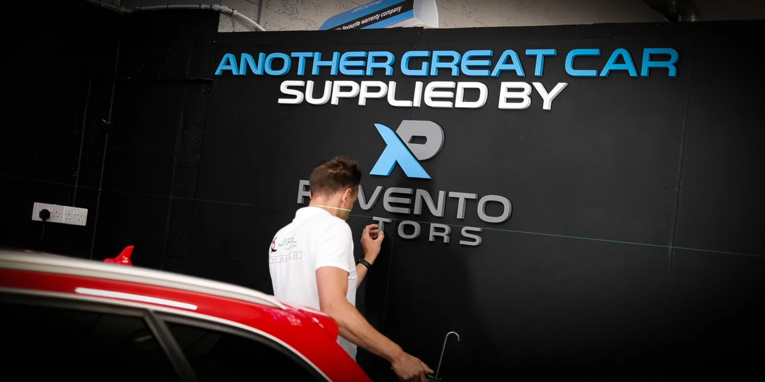
Getting the basics of logo sizing right is crucial for maintaining a strong and consistent brand presence across all platforms. The ideal logo size depends on where it will be used, and each platform has its own logo size guidelines to ensure your company name and symbol are always clear and legible.
For social media, each site has specific requirements. For example, a Facebook profile picture should be at least 180 x 180 pixels, while a Twitter profile picture is best at 400 x 400 pixels. Instagram profile photos are displayed at 110 x 110 pixels, but uploading a larger, high-resolution image ensures your logo looks sharp. Cover photos and banners, such as those on Facebook or LinkedIn, require much wider dimensions, so always check the latest recommendations for each platform.
Website logos should be optimized for fast loading and crisp display. Typically, a website logo in the header or navigation bar ranges from 250 x 100 pixels to 400 x 100 pixels, depending on your website builder and design. To avoid slowing down your site, keep the file size under 200KB and use PNG files for a transparent background or SVG files for scalability without losing quality.
For print, always use a vector file format (such as SVG or EPS). Vector files can be scaled to any size—from small icons on business cards to large signage—without any loss of quality. This is essential for professional signage, where your logo may need to be reproduced at a much larger scale.
By following these logo size guidelines and choosing the right file format for each use, you’ll ensure your logo always looks its best, whether it’s on a social media profile picture, a website header, or a printed sign.
While every space is different, there are some general size ranges that work well in most environments. When planning your logo sign, it’s important to consider standard measurements and standard dimensions to ensure consistency and optimal visibility.
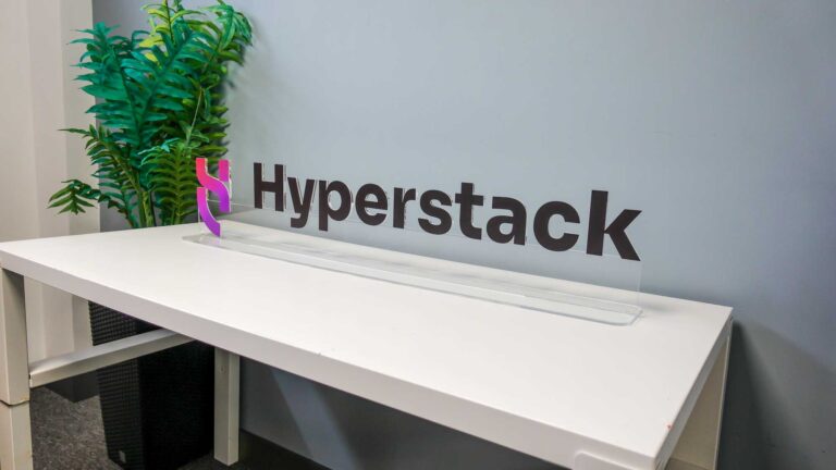
For smaller walls or compact spaces, such as behind a desk or in a small office, signs around 50 cm to 70 cm wide tend to work well.
For medium-sized walls, which are the most common in offices and reception areas, 80 cm to 120 cm wide is usually the ideal range. This aligns with standard print sizes and takes into account the physical size needed for clear visibility without overpowering the space.
For larger walls or feature areas, especially in open-plan offices or high-ceiling spaces, signs 120 cm to 180 cm or more can work really well. When determining the maximum size, keep in mind that signs should ideally occupy 50% to 75% of the total available width of the storefront. These larger signs create a stronger visual impact and help fill the space properly.
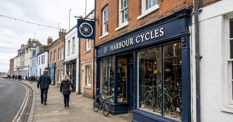
Fascia signs usually range between 40% to 70% of the shopfront width, with recommended heights of 40 to 80 cm for various shop sizes. For shops under 3 metres wide, a fascia height of 40–50 cm is often recommended, while larger shops can accommodate heights up to 80 cm.
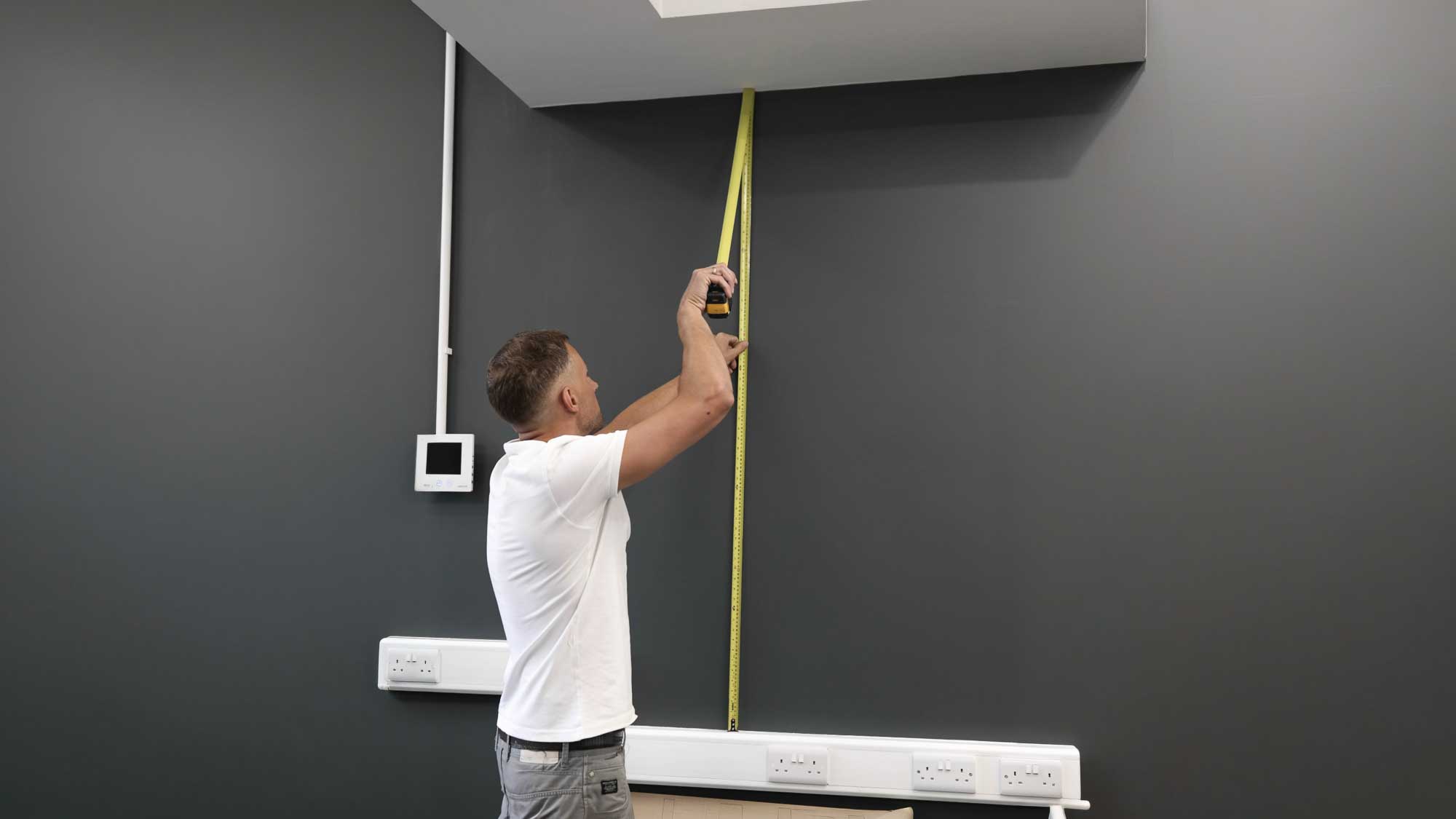
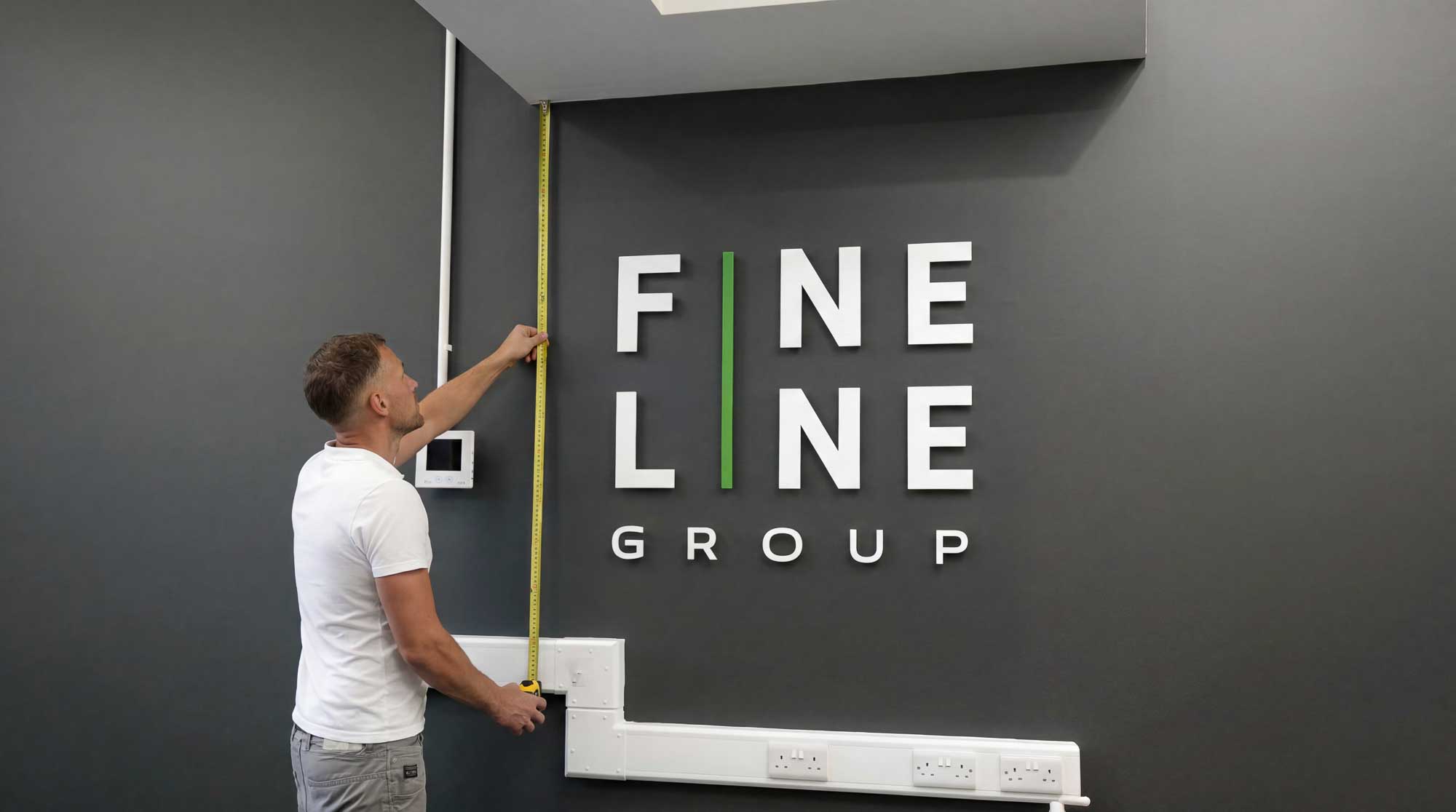
Before choosing a size, it is important to measure the available wall space.
Start by measuring the full width of the area where the sign will go. As a general rule, your logo sign should take up around 60% to 80% of the available width. This keeps it centred and visually balanced, while avoiding too much space around the sign that could disrupt the overall design.
It is also important to leave some space around the sign. Avoid placing it too close to edges, ceilings, or furniture, as this can make it feel cramped. Remember, logo placement and sizing may need to be adjusted for different contexts, such as retail, office, or event spaces.
If possible, mark the size on the wall using tape. When doing this, consider the aspect ratios of your logo to ensure it looks balanced and fits well within the marked area. This gives you a much better sense of how it will look in real life.
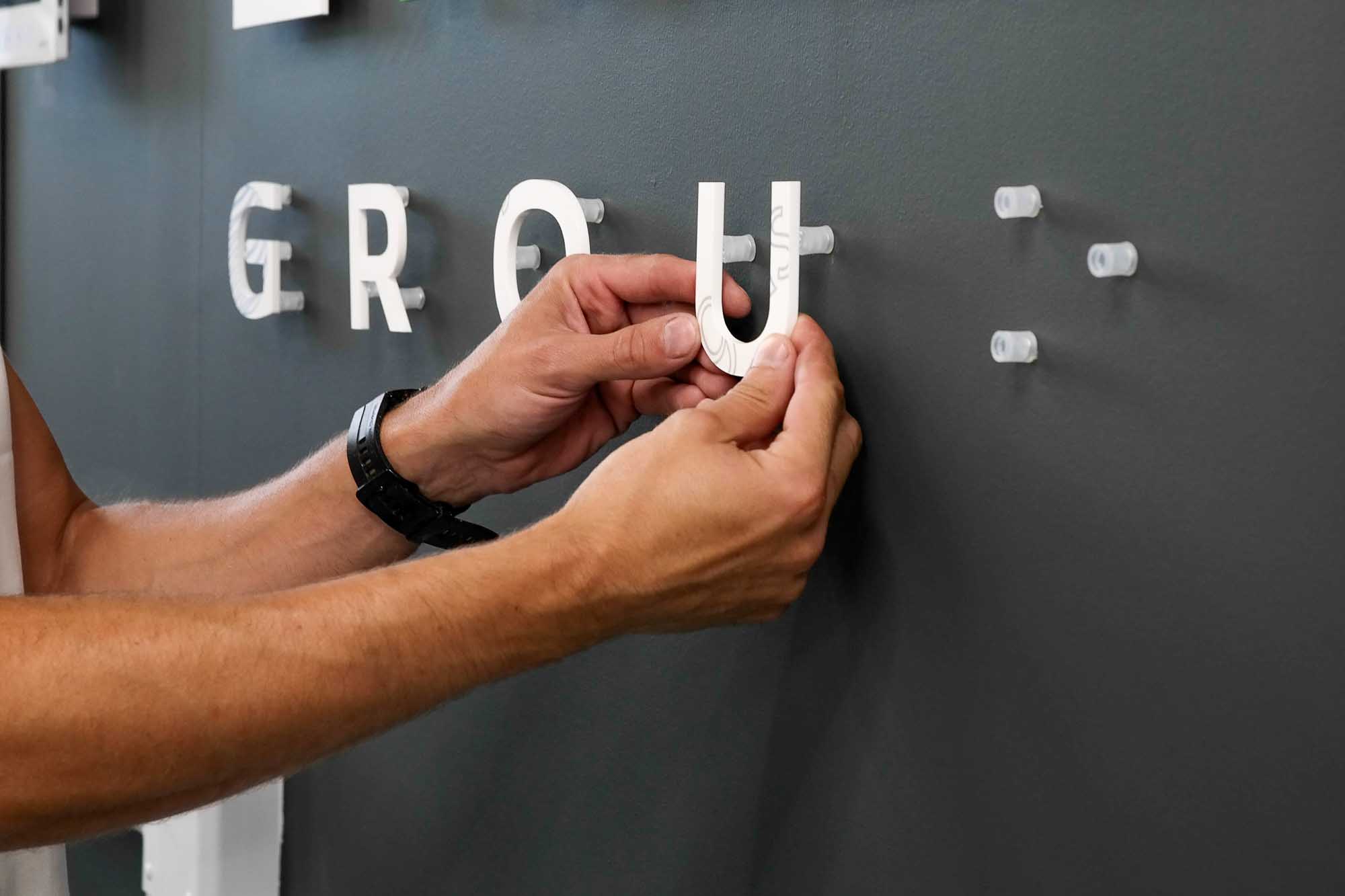
One of the most common mistakes is choosing a sign that is too small. It might seem like a safe option, but it often results in the sign looking underwhelming once installed.
Another mistake is not considering viewing distance. If your sign is meant to be seen from across the room, it needs to be large enough to be easily readable.
Trying to include too much detail in a small size can also be a problem. Fine elements, thin lines, or small text may not work well unless the overall sign is large enough.
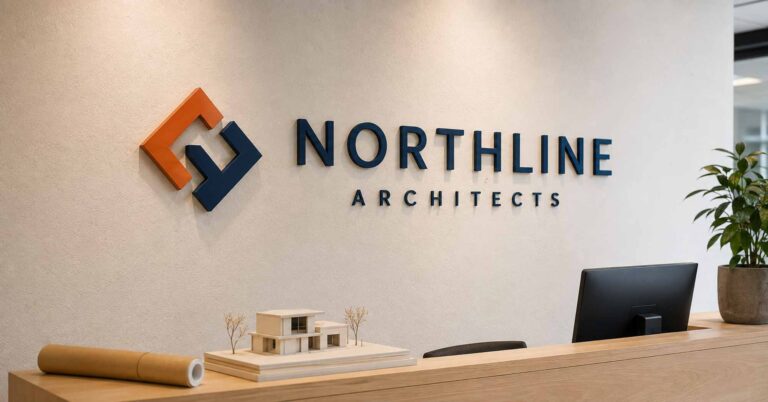
In most reception areas, we find that signs between 90 cm and 120 cm wide work best. This size gives a strong presence without taking over the entire wall. Many businesses customise logo sizes for different platforms and purposes, ensuring their branding is effective whether displayed in a lobby, on social media, or in print.
For desk areas or smaller feature spots, something around 60 cm to 80 cm is usually enough. To maintain consistency and versatility, it’s important to create multiple logo variations and adjust logo elements—such as layout, colour, and format—for each application. Maintaining a consistent logo appearance across different platforms is crucial for brand recognition and professionalism, which can be achieved by preparing multiple logo variations for specific uses.
For larger feature walls, especially in modern offices, clients often go for 120 cm to 150 cm or more, depending on the space. These create a real focal point and help the branding stand out. Having multiple logo variations increases the versatility of how and where a brand can be displayed, allowing for different contexts such as social media, print, and merchandise. Logo variations can include different layouts, such as horizontal, vertical, and icon versions, which help maintain brand consistency across various platforms. Different logo types, such as wordmarks, symbols, and emblems, can be adapted for diverse uses, ensuring that the logo remains effective in various applications.
Yes, slightly.
3D logo signs naturally create more depth and shadow, which makes them feel more prominent on the wall. Because of this, they can sometimes appear larger than flat signs of the same size. When choosing between 3D and flat signs, consider how each option aligns with your corporate identity, as the sign type can reflect your company’s overall brand image and professionalism.
Flat acrylic signs, especially on clear backgrounds, may need to be slightly larger to achieve the same visual impact. It’s also important to consider colour variations—such as black, white, grayscale, or monochromatic versions of your logo—to ensure optimal visibility and consistency across different sign types and backgrounds.
Designing a logo for signage requires a thoughtful approach to ensure your brand stands out and communicates effectively with your target audience. The best logo designs for signage are simple, bold, and easily recognizable from a distance. Avoid intricate details or thin lines that may get lost when the logo is scaled up or viewed from afar.
When preparing your logo for signage, always use a transparent background—typically in PNG file format—so it can be seamlessly placed on any sign material or colour. This flexibility is especially important for illuminated signs, banners, and digital displays, where the background may vary.
Consider the environment and the people who will see your sign. For example, a retail store might benefit from a vibrant, eye-catching logo, while a law firm may prefer a more understated and professional look. Tailoring your logo design to your target audience and the specific sign type ensures maximum impact.
Finally, always provide your signage partner with the highest quality file format available, such as a vector file (SVG or EPS). This guarantees your logo will remain sharp and clear at any size, from small door signs to large feature walls, without losing quality. By following these best practices, you’ll create signage that not only looks great but also reinforces your brand identity wherever it’s displayed.
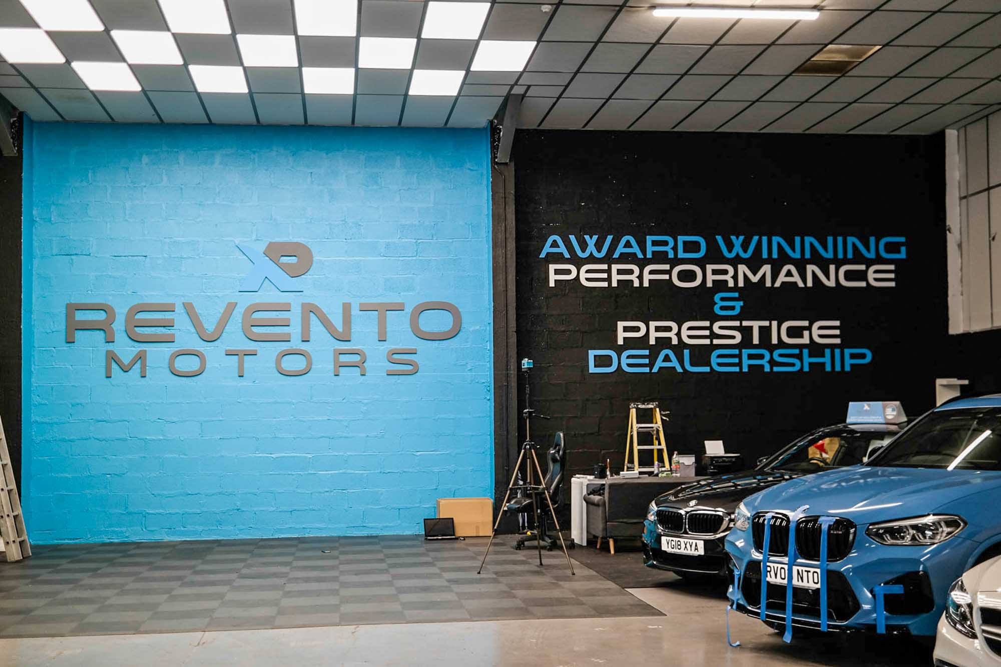
If you have a large wall, high ceilings, or an open reception area, it is usually better to go slightly bigger than you think.
A larger sign:
improves visibility
creates stronger first impression
makes better use of the space
Going too small in a large area is much more noticeable than going slightly too big.
If you are unsure, you are not alone — most people are. The ideal logo sign size varies depending on factors such as location, regulations, and environmental conditions.
The easiest way to get it right is to send over a photo of your wall along with some measurements. We can advise on the best size and even prepare a simple visual preview so you can see how it will look before going ahead.
If you are looking for options, you can explore our 3D logo wall signs and freestanding desk signs, all made to order in custom sizes to suit your space.
Choosing the right size logo sign is about balance. Great logos are designed to be highly versatile, scalable, and maintain their integrity and clarity across various sizes and applications, ensuring they look professional regardless of the medium. Using a vector format such as an SVG file is ideal, as it allows your logo to be resized without losing quality, making it suitable for both small and large signs.
Taking a bit of time to measure properly and choose the right size will make a big difference to how your final sign looks and how your brand is presented.
Explore our made-to-order signage options or tell us what you are looking to create.
More practical signage guides and ideas from Wall Gems.

Our captivating wall signs are crafted to reflect the essence of your brand, communicating your message effectively before anyone steps through the door.