

Your reception area is often the first physical experience a visitor has of your business. Before they speak to a member of staff, enter a meeting room or learn more about your services, they have already started forming an impression from the space around them.
Well-designed reception signage can help make that first impression feel clear, professional and consistent with your brand identity. It can also help visitors understand where they are, reinforce your company logo and bring together the overall aesthetic of the reception area.
The best reception signage ideas are not necessarily the largest or most elaborate. Good design comes from choosing the right position, scale, materials, colours and lighting for the space.
This guide looks at practical ways to approach reception signage design and the details worth considering before choosing a sign.
A reception area has several jobs to do at once.
It needs to welcome visitors, represent the business and provide a functional transition between the entrance and the rest of the office.
Signage can support all three.
A company logo positioned behind a reception desk immediately confirms that visitors have arrived at the right place. Directional signs can guide them towards meeting rooms, lifts or other facilities. Informational signs can communicate useful details without requiring staff to explain them repeatedly.
Reception signage also contributes to the look and feel of the office itself.
In modern offices, branding is often integrated into the interior rather than added as an afterthought. Colours, wall finishes, furniture, lighting and signage can work together to create a more coherent space.
There is no single style that works for every reception.
The right choice depends on the company, the available wall space and the type of impression the business wants to create.
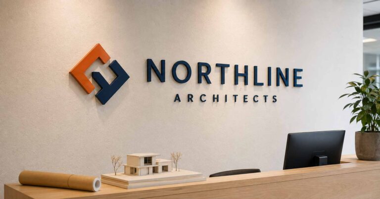
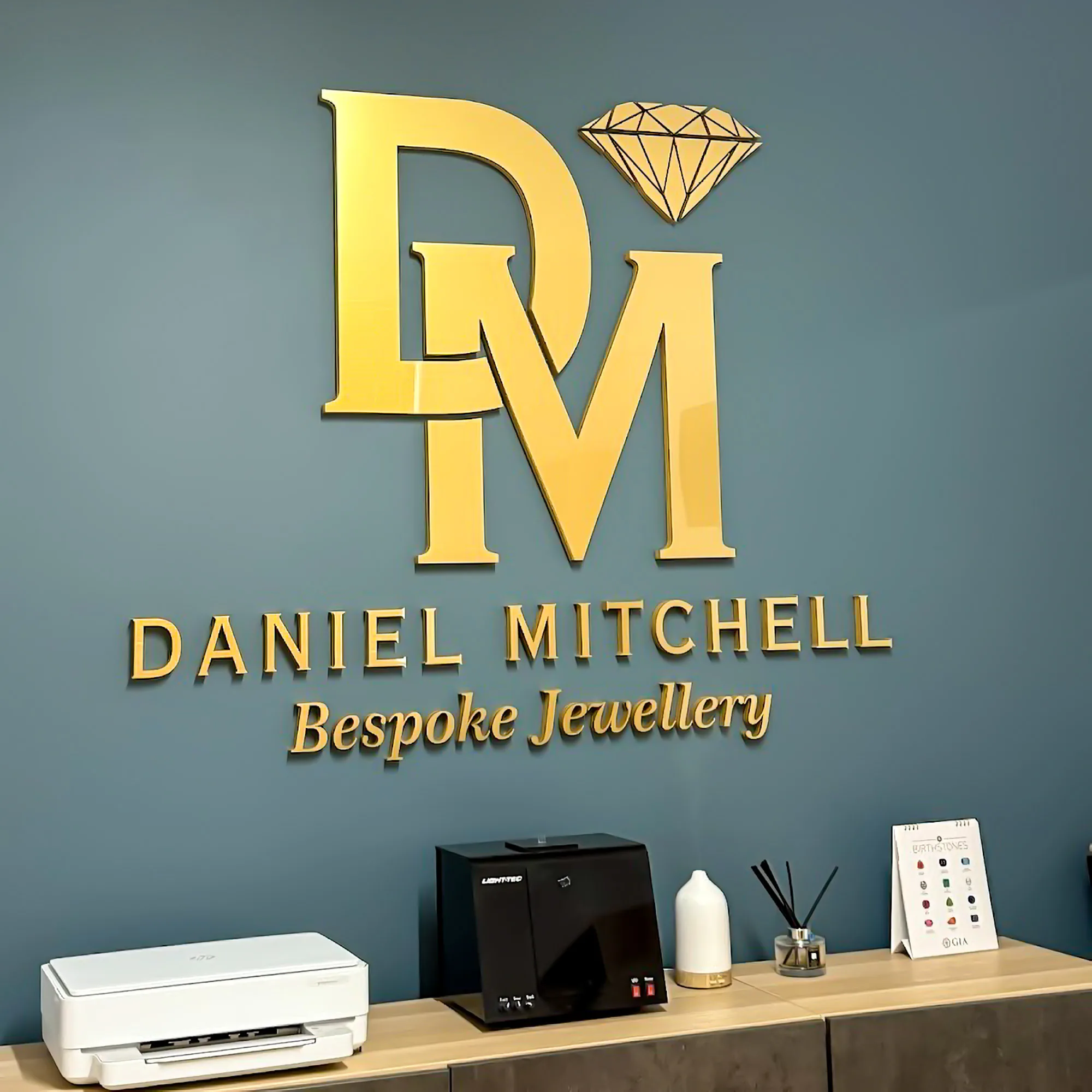
One of the most familiar reception sign ideas is a raised company logo mounted directly onto the wall behind the front desk.
This creates a clear focal point and makes the brand visible as soon as visitors enter.
Raised letters or separate logo elements can add depth without overwhelming the space. Acrylic, painted materials and metal finishes can all create very different results from the same logo design.
This approach tends to work particularly well where the reception desk faces the main entrance.
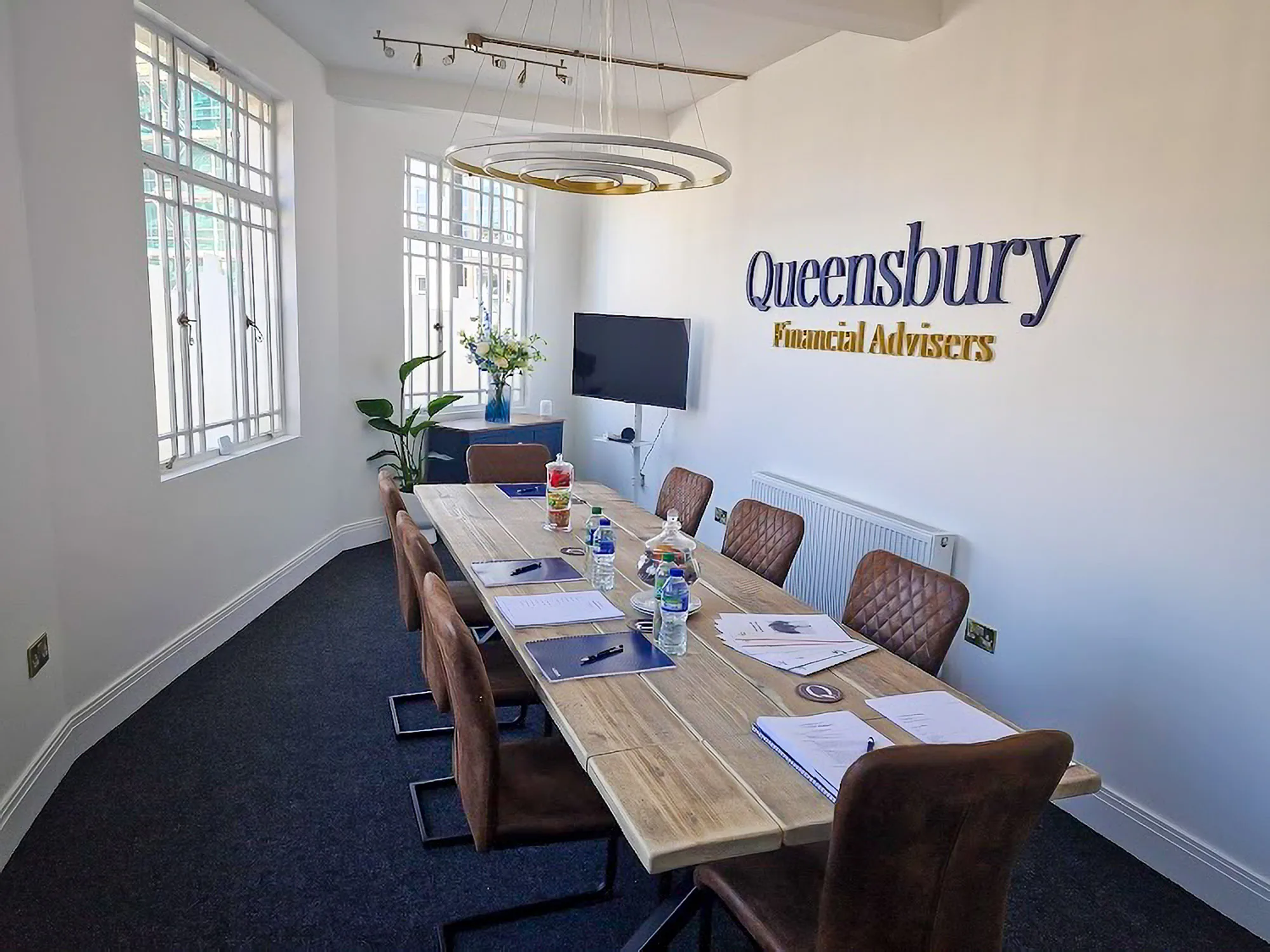
A backing panel can help a logo stand out when the wall itself is visually busy or unsuitable for mounting individual letters directly.
The panel can contrast with the surrounding wall or complement other finishes within the office.
For example, a dark logo on a light acrylic backing panel can produce a clean contemporary appearance, while wood combined with metallic lettering may create a warmer or more premium effect.
Not every office reception area needs the logo directly behind the desk.
A large feature wall can provide a better location, particularly where visitors approach the reception from an angle.
A well-positioned sign can help balance the room and create a focal point that is visible from several different viewpoints.
Glass partitions are common in modern offices, but they require a slightly different approach.
Logos and graphics can be applied to the glass itself, while dimensional elements may sometimes be mounted in front of or adjacent to the glazing.
Contrast is particularly important. A sign that looks clear against a solid wall may disappear visually when positioned against transparent glass and changing backgrounds.
Some spaces benefit from very simple signage.
A small set of raised letters, a monochrome logo or brushed metal finish can suit a restrained corporate office where the surrounding architecture is already visually strong.
Minimalist does not have to mean insignificant. Careful spacing, proportion and material quality can still create a strong first impression.
Materials affect far more than appearance.
They influence weight, depth, durability and how the sign interacts with the rest of the office style.
Acrylic is a versatile option for reception signage because it is available in many colours and finishes.
It can be used for individual raised letters, logos, backing panels or layered designs.
Gloss acrylic can produce a crisp modern appearance, while matt finishes can feel more subtle.
Metal finishes can work particularly well in corporate offices, professional practices and hospitality environments.
Brushed metal, aluminium and metallic-effect materials can create a more architectural look.
The finish should suit the brand rather than simply being chosen because it looks premium. A highly polished metallic sign may feel out of place in an informal creative office, while a brushed finish may complement it perfectly.
Wood can create a warmer, more natural atmosphere.
It is often effective for businesses that want the reception area to feel welcoming rather than highly corporate.
Different wood tones can also work well alongside plants, neutral colours and softer interior finishes.
Using more than one material can create additional depth and visual contrast.
For example, coloured acrylic lettering can be mounted onto a neutral backing panel, or a metallic face can be combined with a darker supporting layer.
The combination should still reflect the brand identity rather than adding complexity for its own sake.
Both flat and dimensional signage can work well.
Flat signage is often suitable where the design needs to be simple, lightweight or economical. Printed panels and graphics can also be useful for information that may change over time.
Raised letters and dimensional signs create more physical depth.
That depth produces shadows and highlights as lighting changes throughout the day, giving the sign more presence within the room.
Dimensional signage is particularly effective where the company logo is intended to become a permanent feature of the reception area.
Businesses looking for made-to-order wall branding can explore our office logo signs.
The size of the sign should be considered in relation to the wall rather than in isolation.
A logo that looks large on a computer screen may appear surprisingly small once installed on a wide reception wall.
At the same time, oversized signage can dominate a compact space.
Consider:
the width and height of the available wall
the distance from which visitors will see the sign
the size of the reception desk
nearby doors, screens and furniture
ceiling height
whether the logo needs to be visible from different angles
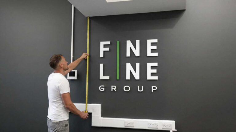
A useful approach is to mark out the approximate sign dimensions on the wall before committing to the final size.
This gives a much clearer sense of scale than measurements alone.
For more detailed measurements and examples, see our guide to choosing the right logo sign size
Placement is just as important as size.
This is often the most natural location because visitors automatically look towards the person greeting them.
The logo should normally sit comfortably above the desk rather than being positioned so low that furniture or computer screens obscure it.
Where the reception desk is off-centre or not visible immediately from the entrance, another wall may provide a stronger visual position.
A feature wall can also allow for larger signage without crowding the front desk.
Some office reception areas benefit from branding positioned close to the entrance itself.
This can help visitors confirm the business location immediately, particularly in shared buildings.
A secondary logo or informational sign can sometimes work within a waiting area, especially in larger corporate offices.
However, repeating the company logo too many times can weaken the overall design.
Usually one strong branded focal point is more effective than several competing ones.
Lighting can have a major effect on how a sign appears.
A beautifully designed logo may lose impact if it is positioned in a dark corner or directly under harsh lighting.
Before considering illuminated signs, first look at the lighting already available.
Spotlights, ceiling lights and natural daylight may provide enough illumination to create attractive shadows around raised letters.
A backlit acrylic logo panel uses LEDs positioned behind the panel to reflect light onto the wall, producing a soft halo around its edges. This creates an illuminated effect without requiring individually lit letters or logo elements.
Backlighting works particularly well in reception areas with lower ambient light or where the logo needs to remain prominent throughout the day. Warm white, cool white or colour-changing RGB lighting can be selected to complement the interior and brand style.
Lighting should support the design rather than overpower it.
The reception sign does not need to reproduce every colour in the company branding.
In some spaces, simplifying the logo or using a single material finish can create a cleaner result.
The important consideration is whether the sign still feels recognisable and consistent with the brand.
Look at:
company colours
wall colour
flooring
furniture
lighting temperature
surrounding graphics
materials already used within the office
A bright company logo may work well against a neutral wall, while a more restrained finish might suit an office with a strong interior colour scheme.
Contrast also matters.
A dark logo mounted on a dark wall may have very little visual impact even if both colours technically match the brand.
A small reception area does not necessarily require a small or insignificant sign.
The key is to avoid overwhelming the room.
Raised letters with moderate depth can provide enough presence without requiring a large backing panel.
A compact logo mounted directly to the wall can also preserve valuable space around the front desk.
In smaller offices, clean typography and simple materials often work better than complicated layered designs.
Larger reception areas create different challenges.
A small sign can easily become lost on a wide wall or beneath a high ceiling.
Corporate offices and larger workplaces may need:
larger lettering
greater spacing between elements
stronger material contrast
deeper dimensional lettering
illuminated signs
additional directional signs
Viewing distance becomes particularly important.
Visitors entering a large lobby may first see the sign from several metres away, so fine details that work close up may not be visible from the entrance.
Not all reception area signs need to focus on branding.
Directional signs can help visitors find meeting rooms, lifts, toilets or different departments.
Informational signs may also communicate opening hours, visitor instructions or safety information.
These functional signs should complement the main reception signage rather than compete with it.
Using consistent typography, colours and materials can help them feel like part of the same environment.
A well-designed reception sign is usually the result of several small decisions working together.
Some common problems are surprisingly easy to avoid.
This is particularly common on large walls.
The sign may look acceptable when viewed close up but lack presence from the entrance.
A sign needs sufficient contrast with the wall behind it.
Matching the exact brand colour is less useful if the logo effectively disappears against the background.
The desk itself affects how the sign is seen.
Monitors, furniture, decorative objects and people standing behind the desk can all obscure part of the wall.
The ideal height depends on the room, but the sign should feel visually connected to the reception area rather than floating close to the ceiling or disappearing behind furniture.
Brand graphics, digital screens, posters, wall art and signage can quickly make a reception feel cluttered.
If the main company logo is intended to be the focal point, give it enough surrounding space to work.
A beautiful finish in isolation may not work with the existing interior.
Material selection should take account of wall colour, lighting, furniture and the wider office style.
Reception signage is only one element of a successful reception area, but it is often one of the first things visitors notice.
The best results usually come from treating the sign as part of the space rather than simply attaching a logo to an empty wall.
Consider the relationship between:
the company logo
reception desk
wall finish
lighting
surrounding furniture
viewing distance
visitor movement through the space
When these elements work together, the signage can reinforce the business’s identity without feeling forced or overly promotional.
Good reception signage design is about much more than choosing a logo and putting it on a wall.
Placement, size, material, colour, lighting and the proportions of the room all influence how the finished sign will look.
Raised letters can add depth and create a more permanent focal point. Acrylic can produce a crisp modern finish, while wood or brushed metal can create a completely different tone. Illuminated signs may work particularly well in darker reception areas, while a simple unlit logo may be the better choice in a bright modern office.
The strongest reception signage ideas are usually those that fit naturally into the space and support the wider brand identity.
If you are planning a made-to-order logo for your reception or workplace, explore our office logo signs or contact us to discuss your project.
Excerpt:
Explore practical reception signage ideas covering logo placement, materials, colours, lighting and sizing to create a professional and welcoming office reception.
Explore our made-to-order signage options or tell us what you are looking to create.
More practical signage guides and ideas from Wall Gems.

Our captivating wall signs are crafted to reflect the essence of your brand, communicating your message effectively before anyone steps through the door.