
Colour is more than just decoration—it’s one of the most powerful tools in a brand’s visual toolkit. For businesses investing in wall signage, understanding how colour influences perception can be the key to making a lasting impression. From 3D signs in corporate offices to wall logos in reception areas, every shade speaks volumes.
In this article, we explore the psychology of colour in business signs, guiding you to make colour choices that align with your brand message and influence customer behaviour—while also highlighting how signs like our 3D Matt Logo Acrylic Faced Wall Sign and 3D Wall Plaque can bring those colours to life.
Colour is often the first thing people notice. According to research:
Up to 90% of snap judgements made about products can be based on colour alone.
Colour boosts brand recognition by as much as 80%.
In the context of business signage, the colours you choose can:
Attract attention
Set the tone for your brand
Influence how trustworthy or high-end your business feels
Drive emotional responses or action
Highlight important information for customers
Often used in finance, tech, and healthcare. It’s a safe, dependable choice for corporate wall logos or professional service firms.
Ideal for: Law firms, banks, medical clinics, and B2B businesses.
Red grabs attention. It’s dynamic and high-impact, making it great for promotions or brands wanting to evoke excitement.
Ideal for: Gyms, food brands, or call-to-action signage.
Yellow radiates positivity. It works well for creative industries or informal brands but should be used in moderation to avoid overwhelming the eye.
Ideal for: Agencies, children’s services, or modern lifestyle brands.
Black communicates authority and high-end appeal. It pairs beautifully with metallic or matt finishes in 3D signs.
Ideal for: Luxury brands, fashion retailers, or high-end tech.
White reflects clarity and minimalism. In signage, it works best as a background colour or accent within a wall sign design.
Ideal for: Wellness brands, clinics, or Scandinavian-inspired interiors.
Green is calming and associated with nature and health. It’s great for businesses wanting to express environmental responsibility.
Ideal for: Organic shops, eco-focused startups, or health clinics.
Purple combines the stability of blue and the energy of red. It’s rich, bold, and expressive.
Ideal for: Beauty salons, spas, or boutique brands.
Let’s connect the theory to real-life reactions. Here’s how colour in business signs influences customer thinking:
Colour | Perceived Emotion | Customer Response |
|---|---|---|
Blue | Safe, Professional | Trust the brand |
Red | Exciting, Bold | Take immediate action |
Black | Premium, Strong | Expect luxury service |
Green | Calm, Natural | Feel relaxed and welcomed |
Yellow | Happy, Playful | Engage with curiosity |
Choosing high-contrast colours for business signs ensures they remain visible and effective from a greater distance, helping attract more customers.
When choosing colours for your business signs, consider material,
Are you formal or friendly? Premium or playful? Choose colours that reflect your values.
A children’s brand and a financial advisor will need very different palettes.
A dark hallway may require brighter colours to pop, while a glass-fronted lobby may suit darker, more matt tones.
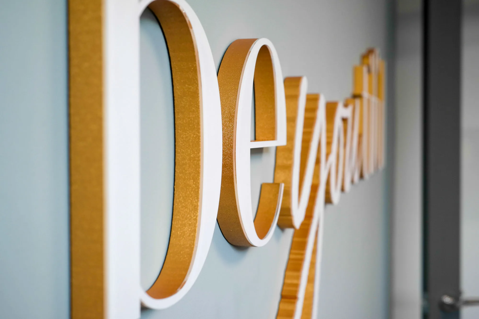
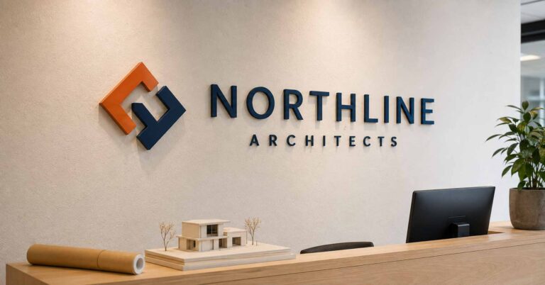
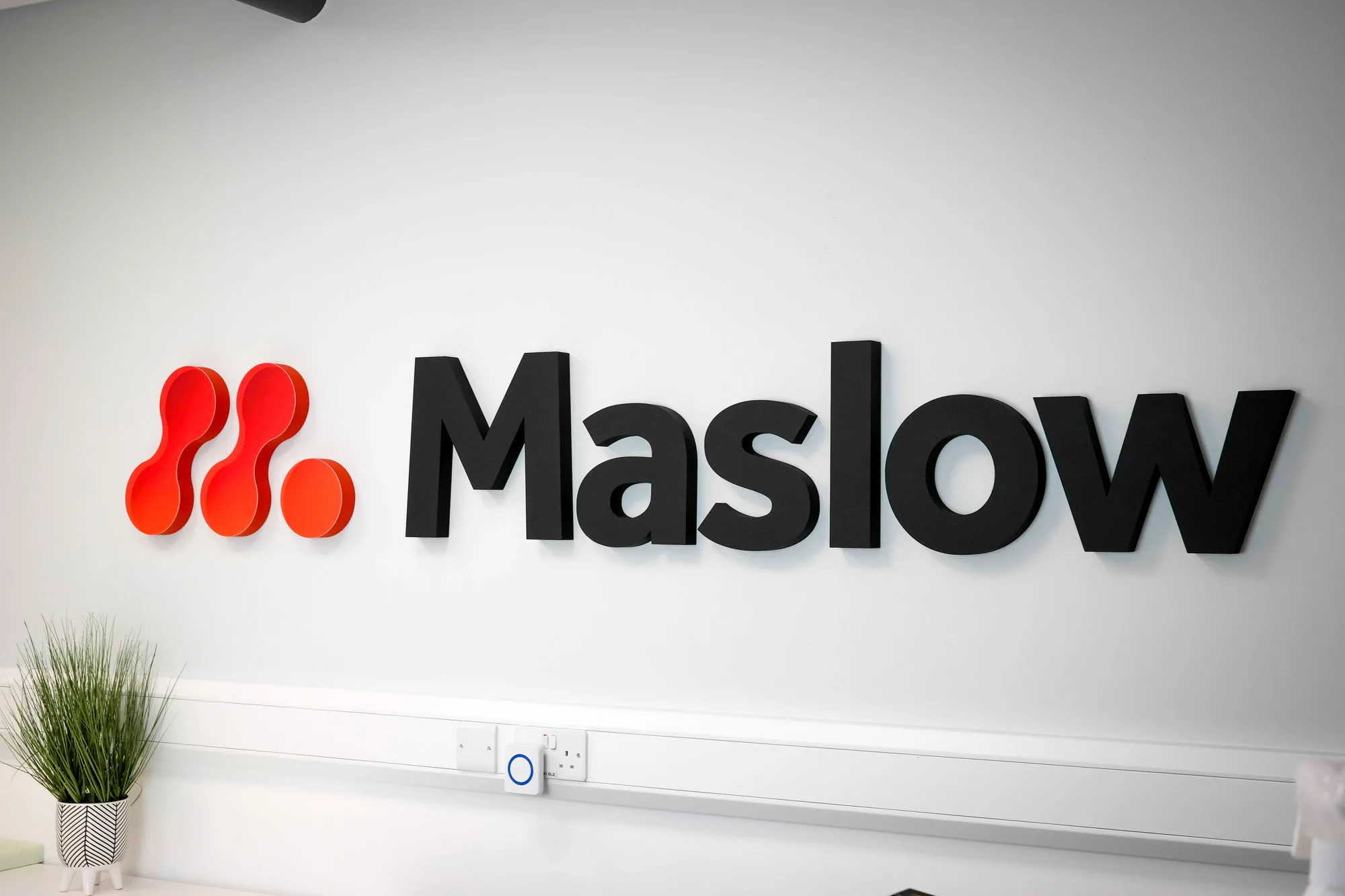
One of the best ways to showcase brand colours is through 3D matt acrylic signage. Our 3D Matt Logo Acrylic Faced Wall Sign offers a sleek, contemporary way to display your brand colours with depth and texture.
Unlike printed posters or vinyl graphics, 3D matt acrylic signs elevate your brand with tangible, architectural presence.

Our 3D Wall Plaque signs are perfect for highlighting secondary colours or accents in your brand palette. For example:
A black plaque with gold lettering evokes prestige
A white plaque with blue lettering signals clarity and trust
A brushed silver base with red 3D lettering creates bold contrast
Wall plaques are ideal for:
Meeting rooms
Reception desk backdrops
Company mission statements or values
These plaques can be mounted on various types of walls, making them a versatile solution for enhancing branding and wayfinding throughout your office space.
If your brand uses more than one colour, here’s how to keep your signage looking clean and professional:
Stick to 2–3 main colours – Use one dominant and one or two secondary colours for balance.
Use neutral backgrounds – Let bold colours stand out by placing them on white, black, or grey surfaces.
Avoid clashing tones – Stay within your brand’s style guide or consult a designer to ensure visual harmony.
Opt for matt over gloss for indoor signs – Matt finishes reduce glare and look more premium—especially in office wall signs.
Choose fonts that complement your colours – Select fonts that enhance readability and match your colour scheme, ensuring your signage is both attractive and easy to read.
Understanding how well your business signs perform is essential for any company looking to make the most of its investment in outdoor signage and custom signs. Effective business signage does more than just display your business name—it increases brand visibility, draws in potential customers, and can directly impact your bottom line. But how do you know if your outdoor business signs are truly working for you?
The first step is to track key metrics that reveal how your signs are influencing customer behaviour. For outdoor signs and outdoor business signage, impressions—the number of people who see your sign—are a fundamental measure. High-traffic locations and strategic placement can dramatically boost these numbers, ensuring your message reaches as many eyes as possible.
Engagement is another important metric. This could include customers taking photos of your eye catching signs, sharing them on social media, or even mentioning your signage when they visit your business. Conversion rates—how many people take a desired action, such as entering your shop or making a purchase after seeing your sign—are perhaps the most telling indicator of your signage’s effectiveness.
The materials and design options you choose play a crucial role in these outcomes. High quality materials like aluminium signs and acrylic signs are not only durable for long term outdoor signage but also maintain their vibrant colours and sharp details, ensuring your message stands out in any weather. Custom signage, including double sided printing, allows you to maximize visibility and communicate multiple messages, making your signs even more versatile and effective.
The colours you choose for your business signs do more than beautify your space—they communicate. By understanding the psychology of colour, you can create wall signs and 3D logos that:
Build trust
Attract the right audience
Reflect your brand identity with clarity
Whether you opt for calming blues, bold reds, or luxurious blacks, let your signage speak volumes with color, form, and finish. And with premium products like our 3D Matt Logo Acrylic Faced Wall Signs and 3D Wall Plaques, your brand will leave a lasting impression—one colour at a time.
Explore our made-to-order signage options or tell us what you are looking to create.
More practical signage guides and ideas from Wall Gems.
Our captivating wall signs are crafted to reflect the essence of your brand, communicating your message effectively before anyone steps through the door.